
| Key Takeaways |
|---|
| • Understand color theory basics for modern decor • Use a 60-30-10 color rule for balanced interiors • Incorporate neutral colors as a foundation • Add pops of color with accessories and lighting • Consider the mood and function of each room • Experiment with monochromatic and complementary color schemes • Use lighting to enhance your chosen color palette |
1. The Basics of Color Theory in Modern Decor
Color theory is like a secret code for making rooms look amazing. It’s all about how different colors work together to create a mood or feeling. In modern decor, we often use colors that are calm and simple, but we can also add exciting pops of bright colors to make things interesting.
The color wheel is a super helpful tool for picking colors that look good together. It shows you which colors are friends (complementary colors) and which ones are family (analogous colors). Understanding this can help you create rooms that look put together and stylish.
| Color Relationship | Description | Example |
|---|---|---|
| Complementary | Colors opposite each other on the color wheel | Blue and Orange |
| Analogous | Colors next to each other on the color wheel | Blue, Green, and Purple |
| Monochromatic | Different shades of the same color | Light Blue, Medium Blue, Dark Blue |
2. The 60-30-10 Rule: A Simple Guide to Color Balance
The 60-30-10 rule is like a recipe for making your room look balanced and beautiful. It’s super easy to remember: 60% of your room should be your main color, 30% should be your secondary color, and 10% should be your accent color. This rule helps make sure your room doesn’t look too busy or boring.
For example, in a living room, you might have white walls (60%), a gray sofa (30%), and yellow throw pillows or a gold chandelier (10%). This creates a modern, balanced look that’s easy on the eyes.

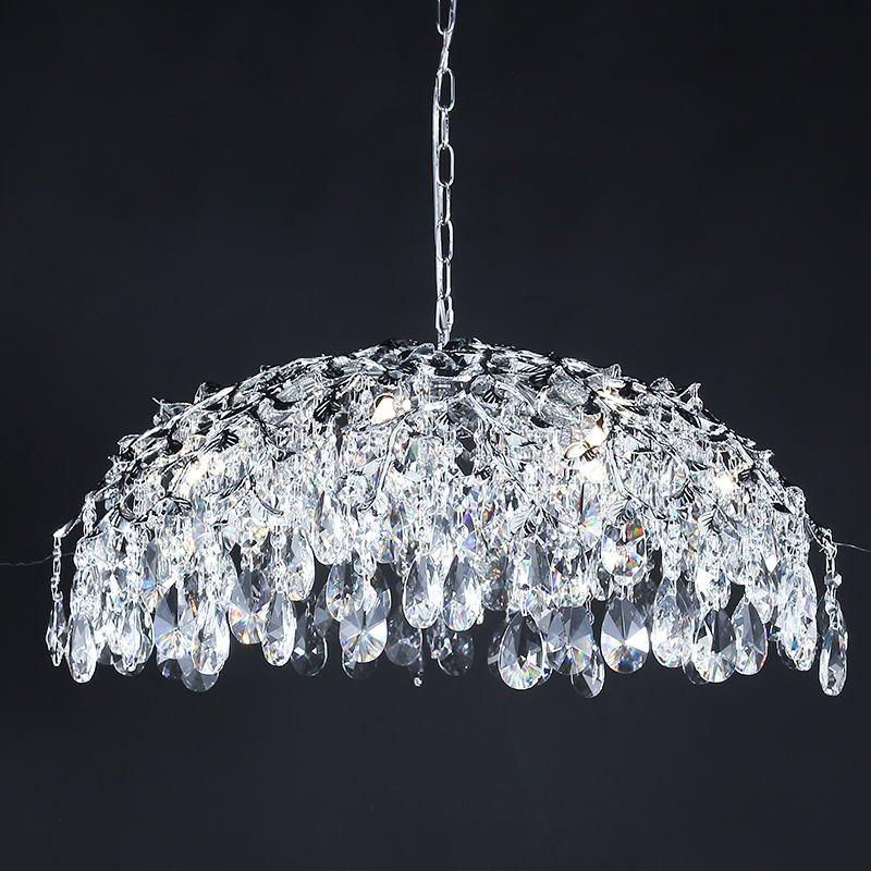
These chandeliers can serve as beautiful accent pieces in your 60-30-10 color scheme.
3. Neutral Colors: The Foundation of Modern Decor
Neutral colors are like the best friends of modern decor. They’re calm, easy to match, and make a great background for other colors. Think of colors like white, beige, gray, and black. These colors can make your room feel spacious and peaceful.
Using neutral colors as your main color (remember the 60% from our 60-30-10 rule?) gives you lots of freedom to play with other colors in your furniture and decorations. It’s like having a blank canvas to create your perfect room!
| Neutral Color | Mood | Best Used In |
|---|---|---|
| White | Clean, Spacious | Living Rooms, Kitchens |
| Beige | Warm, Cozy | Bedrooms, Studies |
| Gray | Sophisticated, Calm | Home Offices, Dining Rooms |
| Black | Dramatic, Elegant | Accent Walls, Furniture |
4. Adding Pops of Color: Accessories and Lighting
Once you have your neutral base, it’s time for the fun part – adding pops of color! This is where you can let your personality shine. Use colorful accessories like throw pillows, rugs, artwork, or even a funky lotus blossom chandelier to bring life to your room.
Lighting is a super cool way to add color too. Colored lampshades or branch chandeliers with colorful crystals can create amazing effects, especially at night. It’s like having a mini light show in your room!
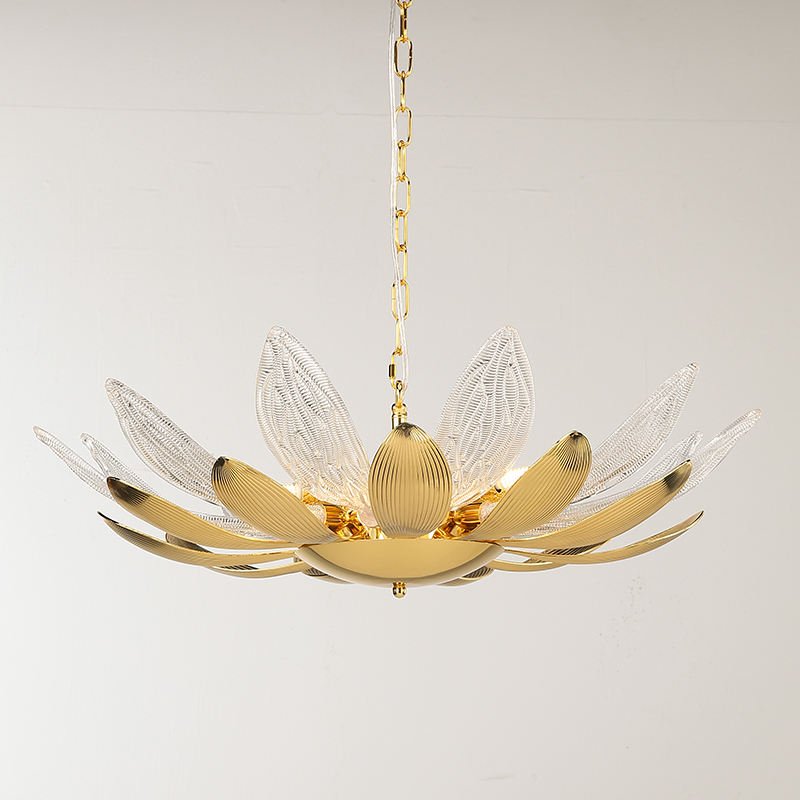

These chandeliers can add a vibrant pop of color and texture to your modern decor.
5. Room-by-Room Color Matching Guide
Different rooms in your house might need different color schemes. The colors you choose can change how a room feels and what it’s good for. For example, bedrooms usually look best with calm, relaxing colors, while a home office might need energizing colors to help you focus.
Let’s look at some ideas for different rooms in your house. Remember, these are just suggestions – you should always choose colors that make you happy!
| Room | Suggested Color Scheme | Mood | Complementary Chandelier |
|---|---|---|---|
| Living Room | Neutral base with bold accents | Welcoming, Energetic | Luxe Crystal Umbrella Branch Chandelier |
| Bedroom | Soft, cool colors | Relaxing, Peaceful | Ethereal Icicle Chandelier |
| Kitchen | White with warm accents | Clean, Appetizing | Elegant Gold Lotus Flower Pendant Light |
| Home Office | Cool neutrals with energizing accents | Focused, Productive | Luxe Gold Crystal Branch Chandelier |
6. Monochromatic and Complementary Color Schemes
Monochromatic color schemes use different shades of the same color. It’s like having a favorite color and using light, medium, and dark versions of it in your room. This can create a super stylish and calm look. For example, you could have light blue walls, a medium blue sofa, and dark blue throw pillows.
Complementary color schemes use colors that are opposite each other on the color wheel. These colors create a bold, exciting look when used together. For instance, blue and orange or purple and yellow. Be careful not to overdo it – use one color as your main color and the other as an accent for the best effect.
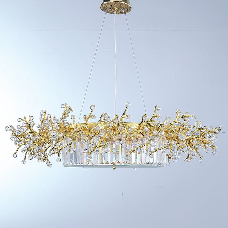
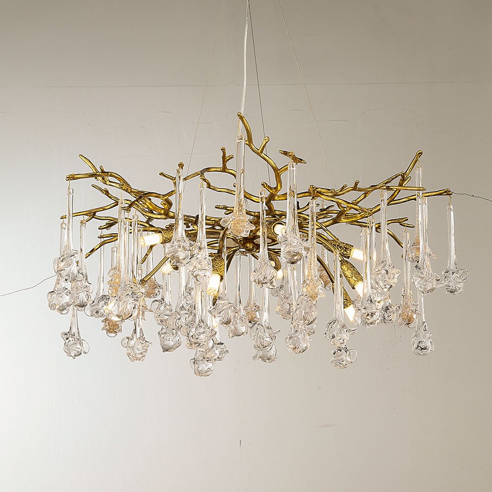
These chandeliers can work well in both monochromatic and complementary color schemes, adding a touch of elegance to your decor.
7. The Role of Lighting in Color Perception
Did you know that the type of light in your room can change how colors look? It’s true! Natural daylight shows colors in their truest form. Warm light bulbs can make colors look more yellow or orange, while cool light bulbs can make colors look more blue or green.
When you’re choosing colors for your room, it’s a good idea to look at them under different types of light. This way, you’ll know how they’ll look at different times of the day. You can also use LED chandeliers that let you change the color of the light to create different moods in your room.
| Light Type | Effect on Colors | Best For |
|---|---|---|
| Natural Daylight | True color representation | Daytime activities, reading |
| Warm Light (2700-3000K) | Makes colors appear warmer | Living rooms, bedrooms |
| Cool Light (3100-4500K) | Makes colors appear cooler | Kitchens, bathrooms |
| Daylight (5000-6500K) | Bright, energizing light | Home offices, craft rooms |
Conclusion: Creating Your Perfect Color Palette
Color matching with modern decor is all about finding the right balance. Start with neutral colors as your base, use the 60-30-10 rule to add structure, and don’t be afraid to add pops of color with accessories and lighting. Remember that different rooms might need different color schemes, and always consider how lighting affects your chosen colors.
Most importantly, have fun with it! Your home should reflect your personality and make you feel happy. Whether you prefer calm, monochromatic schemes or bold, complementary colors, there’s a perfect palette out there for you. And don’t forget, a beautiful custom chandelier can be the perfect finishing touch to your color-coordinated modern decor!
“Color is a power which directly influences the soul.” – Wassily Kandinsky
Ready to transform your space with the perfect colors and lighting? Contact us for personalized advice on how to incorporate stunning, color-coordinated chandeliers into your modern decor.


